When you look at a product page from your favorite brand, what do you see?
A picture of the product, the price, the description, and then maybe the social media buttons to share on your profile. If it has customer reviews, you might see the rating and hyperlink to said reviews. Learn how you can use those customer reviews to generate revenue.
Product Page and Product Descriptions
The product page layout and product descriptions vary for every eCommerce site, but they all usually follow a template like the one mentioned above. It’s on the eCommerce business to then decide how to make that template their own. This is done by product pictures, descriptions, layout, colors, and options. Let’s look at some examples of the product page for different eCommerce sites. Take what works best for these eCommerce sites to get an idea of what works best for your eCommerce site.
Let’s start with Nike:
Nike Mercurial Superfly V FG Cleats
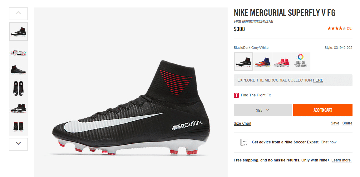
Here you see that there are 6 different pictures of the cleat to showcase all angles of the product. This leaves out the guessing game of what the shoe might look like from underneath or how the color or design wraps around if it does.
It starts with a title, a mini description, followed by the price and then the customer rating in star format and the number of ratings. The block on the left has everything you need when shopping for a shoe. The size chart, a method to find the right size for you, and customer service if you have any more questions. You might have noticed that it doesn’t have a detailed product description. That can be found when you scroll down on the page.
Product Description
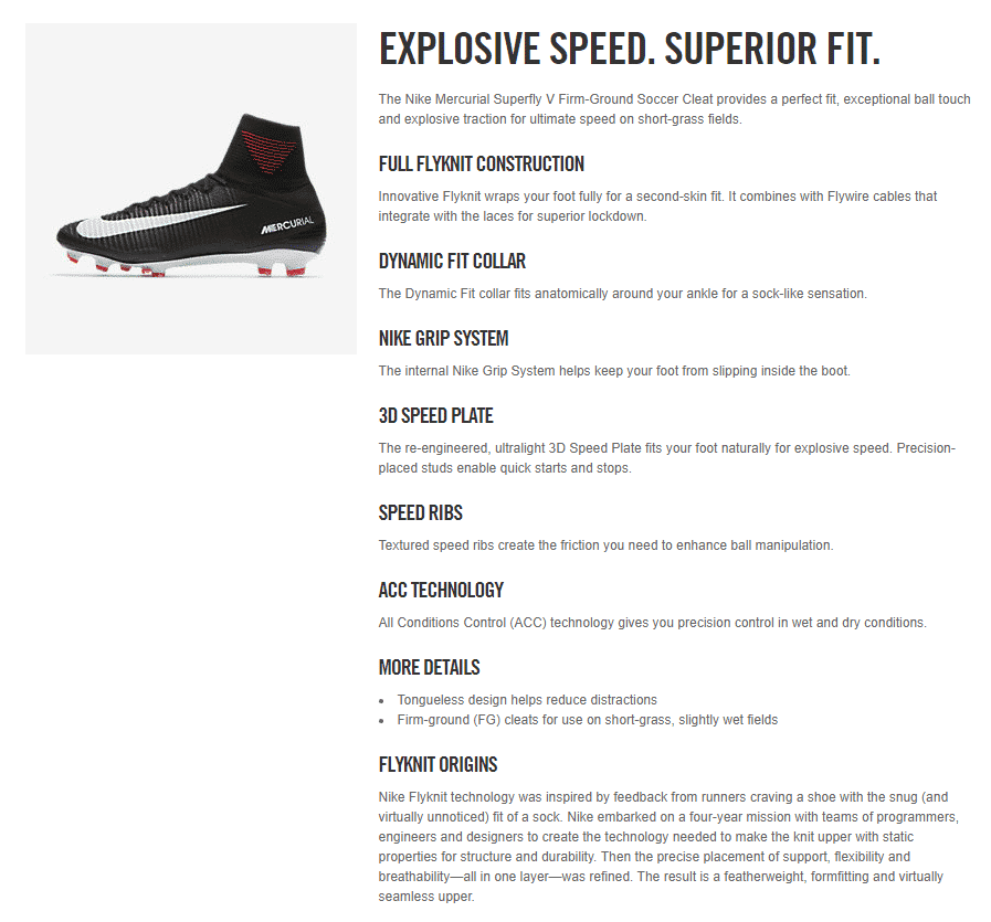
Now you can really dig into all the information of the shoe. Material, features, design, and the origin story of the cleat.
What went into creating this one product page out of hundreds and thousands of all Nike products? A lot of research and time.
To write a product page you have to define who the product is for. The target audience. Each demographic and psychographic is different and requires a certain voice or tone.
Who is the product for: A target audience. Each demographic and psychographic is different and requires a certain voice or tone.
Basic product details: Dimensions, materials, and the product features and any functions.
Where would you use the product: Outdoors, indoors, home use only or outdoor use only. On certain surfaces.
When should you use the product: Certain time of day, certain seasons, everyday usage. Also important to mention if the product has any lifetime usage limit.
If you feel your brand is strong enough or would benefit from comparison to other similar products, then add that information. If your product has better features, note that.
Another example of a product page is Keurig:
Keurig The Original Donut Shop Coffee
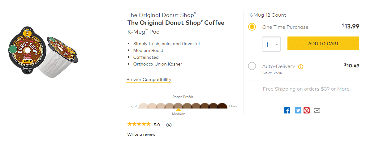
Already there is a difference in the way the product page is laid out. Because the product is relatively simple, there really isn’t a need for more than two pictures. It has 4 bullet point descriptions. Bullet points are especially important since when shoppers only want the quick, important details. Highlight the best feature and then explain them more in the section below. The star review is located at the bottom instead of within the pricing section like in the Nike product page.
Keurig has an extended product description just below the product, like Nike.
Product Description
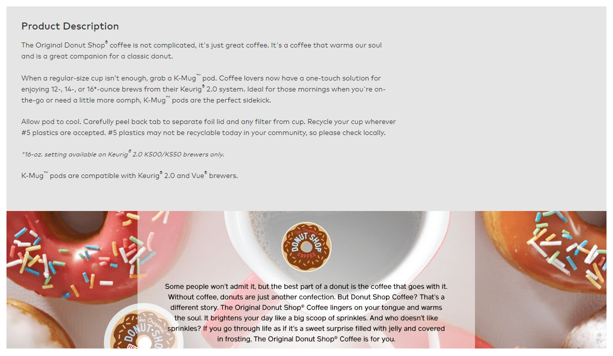
You can see the difference in layout and information provided for the K-Mug compared to the Nike cleat.
Another example of a product page for an eCommerce is Discount Water Softeners:
Discount Water Softeners Genesis Premier Water Softener
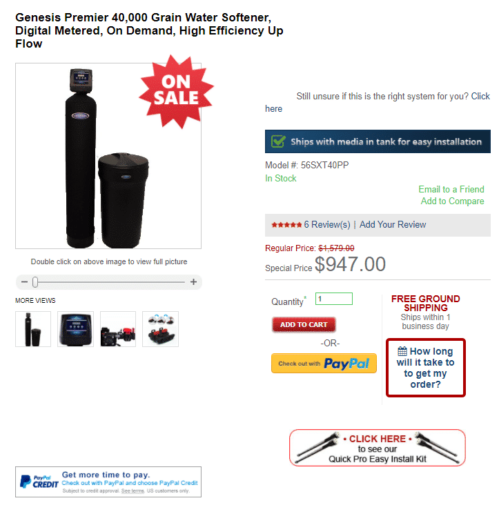
Product Description
A higher priced item would require more information about the product since it is a big purchase item. The product description has a lot of information that hopefully answers all the questions you might have.
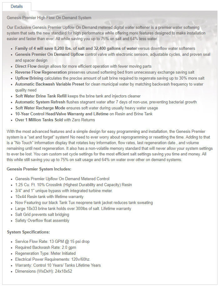
Different products require different information and details. Research who your target market is, what they would like to know about the product, and how you can showcase it best to result in purchases. Referencing other similar brands or products for ideas can help in getting started. Remember to make the product page and description unique. Include bullet points or short sentences vary product pictures and make sure the brand’s voice and tone come across within the description. That’s how you figure out what works best for you.
To sum up, use short, sweet product descriptions, get technical and show personality.
More Perspectives:
Brand Style Guide: Why You Need One
FAQs
What should be included on a product page for an eCommerce site?
A product page should include high-quality product images (from multiple angles), the price, a concise product description, customer reviews, and a clear call-to-action (e.g., “Add to Cart” button). It’s also beneficial to add sizing charts, customer service links, and options for sharing the product on social media.
Why are multiple product images important on a product page?
Multiple product images provide customers with a complete view of the item, reducing uncertainty about its appearance and features. Showing different angles and details, such as close-ups or the underside of a product, helps build customer confidence and reduces the likelihood of returns.
How can product descriptions impact sales conversions?
Effective product descriptions use clear and engaging language tailored to the target audience. They should provide essential details such as dimensions, materials, and key features while highlighting the benefits and intended use. Including this information concisely can help customers make informed decisions, increasing the likelihood of conversions.
Should I use bullet points or paragraphs for product descriptions?
Using bullet points is recommended for highlighting key features and benefits quickly. Many customers prefer skimming for essential details, so bullet points make it easier to digest information. You can provide more detailed explanations below the bullet points in paragraph form for customers who want to learn more.
