Communication is the strongest way to build a lasting connection and what better way to convey a message than through design. A well-thought-out website is great for clearly delivering your organization’s story, informing them of the driving force that brought your organization into fruition. A good design can help you tell your organization’s story. So what are some things that help with telling a good story through your website?
Keep it (your message) simple and honest
The best way to get the point across is to keep it simple. Your audience is not limited to a certain demographic, but everyone from all walks of life, which means you need to be able to relate to everyone. Having text that is too wordy or words that are not commonly used creates a disconnect with your audience. Keeping your text straight to the point and honest helps bridge gaps and lets your audience know who your organization is.

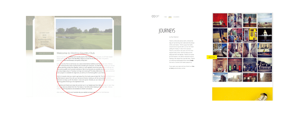
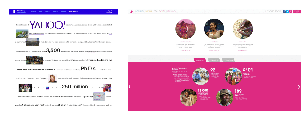
Keep it (your design) clean
As we’ve mentioned before in previous perspectives, keeping your design clean is key to ensuring that your content is easily digestible. Now, this doesn’t mean you should skimp out on the design of your website. Instead, think about giving your audience information in an appealing and presentable format. When you go to a sit-in restaurant you are more likely to enjoy your meal if it is properly plated, rather than if it was carelessly dumped on the plate. You need to keep in mind that it’s all about giving your audience an effortless learning experience.

Use (good) photos
Using good quality photos, especially those with people give your website a human touch. There are 3 parts to a “good quality” photo.
- Good Quality: Amateur vs Professional
One of the differences between a good photo and an amateur is how it’s captured. A seasoned photographer analyzes the entire environment and uses that knowledge to take photos from the best angle. - Good Quality: Real vs Cheesy
What’s worse than a cringe-worthy, cheesy photo? As easily accessible as these types of photos are online, it’s difficult to connect with them. You want to make sure your photos assist your story and using real, genuine photos do just that. - Good Quality: Resolution
High-resolution photos pull in the audience with how well it tells a story through its great detail. Unlike blurry and stretched photos that make your audience think, “I can’t tell what that is.” Now sometimes this isn’t applicable to all websites, such as those that use older, physical (and scanned) photos.

Whether you hire a photographer or purchase stock photos, don’t be afraid to invest. Photos not only help give visual appeal to your website but when coupled with your story, it helps reinforce your message.
A clean and simple design with good quality pictures will go a long way with your organization. An easy to read, straightforward design invites everyone in, you tell your story the way you want. You control your organization’s narrative.
FAQs
How can nonprofits effectively communicate their story through website design?
Nonprofits can effectively communicate their story by keeping their message simple and honest, using clear and relatable language that resonates with a broad audience. A clean, straightforward design ensures the content is easy to digest, helping to engage visitors and convey the organization’s mission.
Why is a clean website design important for nonprofits?
A clean website design ensures that the content is easy to read and visually appealing. It provides visitors with an effortless learning experience and helps them absorb the organization’s message without feeling overwhelmed by cluttered or overly complex layouts.
How do good quality photos enhance a nonprofit’s website?
Good quality photos, particularly those that feel real and authentic, give a website a human touch and help reinforce the organization’s story. High-resolution, professional photos draw in visitors and make the website more engaging and visually appealing.
What type of photos should nonprofits avoid on their websites?
Nonprofits should avoid using cheesy or low-resolution photos, as these can feel disconnected and unprofessional. Instead, they should opt for genuine, high-quality images that align with their message and support their narrative in a meaningful way.
