Brand Style Guide
Plain and simple, a brand style guide is a document that codifies how a business or organization presents itself across all mediums. This document is a reference tool that helps maintain consistency by demonstrating what your brand looks like and how it feels and sounds. The key of a brand style guide, or style guide, is to use it. It will ensure that your brand looks and feels the same when there are multiple people working for the same business or organization. Anyone from customer service to design will know how to create, respond, and maintain the style of the business or organization. I give a great small recap video about why you need a style guide here.
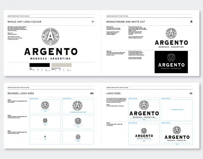
That’s why a brand style guide is so important. It’s how the world sees you and how they build trust. It helps your business or organization communicate in a consistent way across all mediums. And consistency is key. If you are inconsistent with your message, vision, logo, color, it will confuse and possibly alienate your customers.
To begin the process of creating your style guide, you need to know your brand. You must have:
- A Mission
- A Vision
- Target Audience
- Brand Personality
- Core Values
Once you have those figured out and written down, you start to research other brand’s style guides to get some inspiration. It will give you an idea as to how you want your style guide to look, feel, and what you want it to contain.
For certain, you want 6 of the following elements in your style guide.
- Brand story
- Logo
- Voice
- Imagery
- Typography
- Color Palette
Brand Story
A brand story is a short summary of your business or organization. It tells people what you’re all about.
Let’s look at Beardbrand as an example. From Beardbrand’s brand story, you can see the problem they saw in the marketplace and built their company around making a change.
- “The shaving fad is ending now, and Beardbrand will be leading the charge.”
- “We were tired of beards being left to kitschy, cheap products.”
- “There is negative terminology used towards beardsmen that still lingers in our culture. For instance, the term “clean-shaven” should be “completely-shaven” or “beardless.””
- “We can’t do this alone, and we need you to help us change society. Connect with us by joining the mailing list below, and most importantly – beard on!” (Nice link to their call to action!)
Your brand story should talk about your company’s purpose (what drives it) and how your company is different from everyone else. Passion and purpose are the fuel for your brand story. It should incite emotions as the goal for any brand is to build a connection with its audience.
Logo
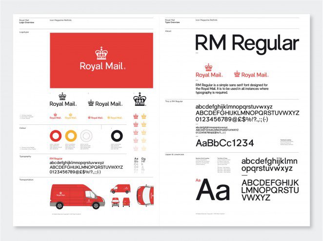
You can’t use the same logo with the same dimensions and colors everywhere. You need to know how your logo is going to look in different mediums. A stretched, altered, or condensed logo sends the wrong message. Having a list of all the approved logos for different mediums with the size, space, and colors provided for each one will make branding easier.

Voice
What I mean by voice is the writing style that is shown across mediums, especially online. A branded voice affects how people feel about you, it can make or break a new fan.
If you have previous work that has gone well with your audience, include that in the style guide as examples. If your business or company is known for funny content, it would make sense that your writing would have some funny element to it. The point of this section is to describe what type of language you want to use, to be on-brand.
Imagery
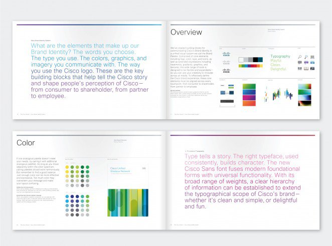
This section of the style guide will let everyone know the right direction that your photos and illustrations need to go without always needing approval from the higher ups. The way to do this is to have examples that fit your brand. All the images need to address the way your business or company communicates on print, on Instagram versus Facebook, letterheads, etc. If you only have a select few images available, find examples from other style guides that are within the same industry. It’ll provide inspiration and will help your brand grow if taken from successful bigger brands. There is also the option of using mood boards. A mood board is a collection of images that intends to evoke or project a particular style or concept.
Typography
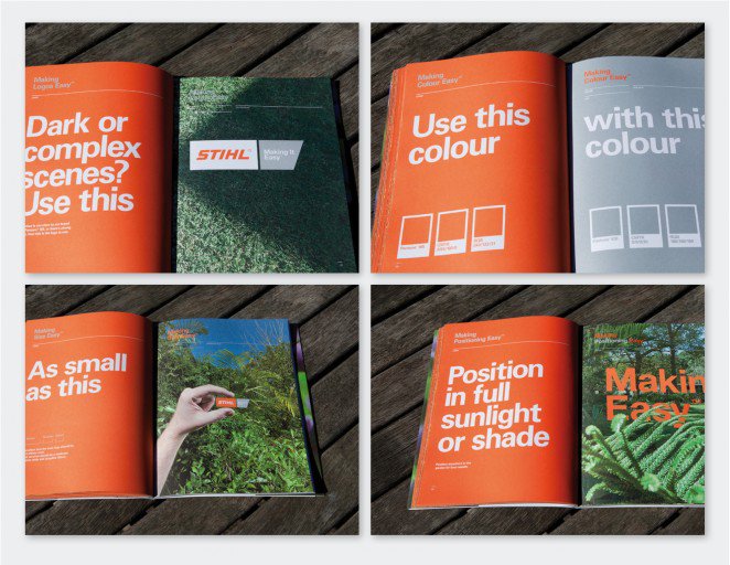
Having a uniform font across all platforms is key with consistency. What your brand and the type of work you do will help you determine if you just use one typeface/font family or use multiple fonts. My recommendation is to use a different font than the logo. The contrast will help it stand out.
Color Palette
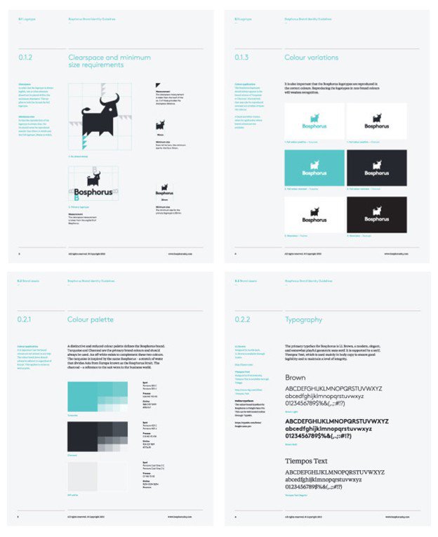
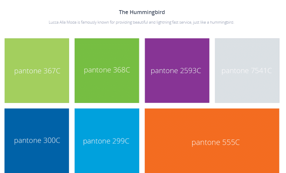
Your color palette includes all of the colors utilized in your branding. A starting point is the colors in your logo. From there you will add any secondary colors to your brand. In the example of the LuccaAM brand, we utilize the colors in our logo (7 in total) and then black with tint variations. You will want to include the common color codes to cover all digital and print needs. This includes Pantone, CMYK, RGB and Hex number.
For example, our Monday Motivation and Fun Fact Friday use Lucca colors for the font colors.

Looking for the best web designers in Rockford? Or the best graphic designers in Rockford? Contact us today by email or give us a call!
FAQs
What is a brand style guide, and why is it important?
A brand style guide is a document that outlines how a business or organization presents itself across different mediums. It ensures consistency in messaging, visual elements, and brand identity, which helps build trust with customers and maintain a unified brand image.
What elements should be included in a brand style guide?
A comprehensive brand style guide typically includes a brand story, logo guidelines, voice and tone, imagery guidelines, typography, and a color palette. These elements help maintain brand consistency across various platforms, whether online or in print.
How do I create a brand story for my style guide?
A brand story summarizes your company’s purpose, values, and what sets it apart from competitors. It should evoke emotion and connect with your audience by explaining your brand’s mission and how it addresses a specific need or problem in the marketplace.
Why is consistency in typography and color palette important?
Consistent typography and color palette ensure that your brand looks professional and cohesive across all mediums. By using the same fonts and colors, you reinforce your brand identity, making it easily recognizable and helping build trust with your audience.
- 5 Tactics for Increasing Black Friday and Cyber Monday Sales in 2024 - March 5, 2024
- 5 Most Important Google Ads Metrics - July 11, 2023
- What is Headless Commerce? - May 23, 2023
