Whether you’re running on Shopify, BigCommerce, or another platform, your eCommerce store is likely where most of your website traffic goes to. The primary eCommerce website usually does the heavy lifting for your revenue generation but where your website is like the general store, landing pages are where you can excel with highly focused sales experiences.
Landing pages are powerful tools for revenue and lead generation. They are faster and easier to build and modify compared to your eCommerce website’s theme, and you can create unique ones for all of your different campaigns.
We build a lot of landing pages for our clients and we’ve learned critical steps to help make them more successful. Let’s go through some of the best practices to get the most out of your eCommerce landing pages.
#1 Know Your Target Shopper
Like with any marketing effort, you should start with your goals and who your target shopper is that will be interacting with your landing page. As we mentioned, your website is your general store and your landing page is where you can really get specific. The language and imagery on your page will differ if your targeting males or females, or tech enthusiasts vs non-tech savvy people.
A few questions to ask yourself as you get started:
- How old are they?
- Where do they live?
- What are their most likely concerns holding them back from buying?
- What features would they find most important?
The more you know about your target shopper, the easier the content will be to create on the landing page.
#2 Stay Simple and Focused
You’re passionate about your product and it can be easy to fall into the trap of wanting to talk about all of the amazing options, features, and advantages your product has. Stay focused on staying true to the information that brought them to this page and what they are expecting. For example, if your landing page is tied to a Facebook ad, keep in mind what the shopper just read about in your ad and what they expect to find when they come to your landing page. Stay focused on those key points that obviously worked to get them to click in the first place. The job of the landing page is to just keep the ball rolling, keep up their interest and excitement of how your product will change part of their life or routine.
Making a shopper scroll through section after section on a landing page about features that likely don’t appeal to them will make them bored and impatient. This will lead to losing potential sales.
#3 Mobile and Desktop
This tip is in regards to how you design and develop your landing page. Most landing page platforms offer a mobile and desktop view of your landing page to provide an optimized experience. It’s easy to put a lot of work into building the content and layout of the landing page and then just treat either mobile or desktop as an unimportant step. Some landing page platforms have features that auto convert your page to be mobile friendly. Be sure to review the layout and make tweaks. Remember that not everything on your desktop version needs to be on the mobile version. This is especially true if you have a lot of design elements on your landing page. Hide most of those on your mobile version and keep the page easy to scroll through.
#4 Reduce Clicks
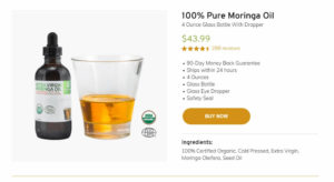
As with most digital shopping experiences, we want to reduce the amount of clicks the shopper has to make to complete a purchase. Each click is another roadblock to completing the sale. Remember that your shopper has already come to your landing page from at least one previous click (likely an ad) and now they are scrolling through your landing page to learn about your product. You can link a “learn more” button on the landing page to your product page, but they still have quite a journey before they can complete their purchase. They will have clicked on your ad, a button on your landing page, clicked the “add to cart” button on your product page, and then the checkout button on the cart page. You can see how many roadblocks are in place here. We like to integrate “add to cart” buttons right on the landing page so all the user has to do is click to add to the cart and then they can head to your checkout page.
If you’re using Shopify, you can use this app: Buy Button Channel
If you’re on BigCommerce, try this one: Buy Button

#5 Measure Results and User Interactions
One of the most important parts of any marketing and advertising effort is to have a measuring and review process in place. Google Analytics is a minimum necessity to see the traffic on your landing page and some basic information of how the shopper is interacting with your page. How long are they on the landing page? What percentage of them add to the cart vs leave? Are there more mobile or desktop viewers? Answering these questions and more will help understand how your page is excelling or can be improved.
If the traffic is coming from an ad, having the Facebook Pixel or Google Ads tracking code on the landing page and main website is important so you can track purchases; although, tracking has become more difficult with the changes Apple has made. However, there is still a good amount of valuable information that can help you understand the effectiveness of your landing page.
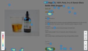
Heatmaps are also a fantastic way to understand how shoppers are interacting with your landing page and can help pinpoint some potential design problems.

Ready to create your landing page?
Landing pages for your eCommerce store are an incredibly powerful and flexible tool in your arsenal. Try out the tips in this article to improve your landing pages’ results today.
Looking for a landing page platform? Unbounce is a great platform. Use this link here to get a discount on your first few months.
