FIVE WAYS TO MAKE YOUR SOCIAL MEDIA ADS STAND OUT MORE
Running social ads can seem simple. Well, at least that’s how they paint it when offered the opportunity to do it yourself. For many, social ads have resulted in disappointing expectations.
As we mentioned in our target market perspective, the key is to create targeted ads that appeal to your target market’s interests, values, and personality. Good ads hit those chords, the best ads hit those chords and make it memorable. You want to ensure your ads are engraved into the viewers mind so they follow up on your call to action.
Here are five ways to instantly make your ads a scroll stopper, yea I said it.
Scroll Stopper– an ad so nice it makes someone stop scrolling to interact with the ad.
Genuine lifestyle imagery
Images are one of the most powerful ways to influence people. People can look at an image and instantly feel a connection to what they’re seeing. For marketers, photography has been a key part of advertising strategies. Whether it’s on a social ad or a billboard, using genuine lifestyle based images will grab the right person’s attention and is more likely to stay instilled in their minds.
Consumers like to be heard. Consumers like to be connected. Consumers like to be represented.
Make sure your image style speaks directly to your target market. Elevate the way people perceive what you offer by creating a lifestyle around your product/service. People spend money at places they can trust, brands that invest in custom photography have a better chance of creating a connection through trustworthy images.
What does a trustworthy image look like? Check out Purple, a mattress manufacturer with a great online presence. We made a mood board of their imagery to showcase how they created a phenomenal photography style. The creative consistency is seen throughout every image they put out, you can easily see that their targeting families who care about comfort, happiness, and love pets. When it’s not lifestyle based, they stick to hyper-targeted angles around their products and brand using a consistent pallet of brand colors. Their ads are easily recognized across the web, this is what every e-commerce should aim to accomplish with their social ads.

Stock photos can work, however, they’re becoming more obvious to consumers. There’s a lot of ads out there these days, it’s not difficult to identify which businesses invest in professional lookbooks, product presentation, and strong image directions. The problem with stock photos is that they are shot to only accomplish the visual, not with the goal to make YOUR brand and what YOU offer look unique and irresistible. In other words, stock photography can make your ads look nice but won’t be as convincing as shooting with your own products, models, locations, and so on. Below is a brand that’s done a great job of creating a lifestyle around their product:
Abstract branded illustrations
Illustrations are a fun way of making social ads stand out. As you look through your social feeds, you’ll notice you see a lot of images and videos. By using illustration based ads, you can break that pattern and offer a different experience.
If you are not able to create your own illustrations, we highly recommend you hire a graphic designer/illustrator to help create a unique illustration style. Hiring a designer also allows you to develop a consistent style that will resonate with viewers. Every illustration you put out should carry a similar ad style, this will ensure that your brand’s image is cohesive and memorable.
Want your illustrations to cause double takes?
Don’t be afraid to create an abstract and unique illustration brand style. Good looking illustrations definitely work, but you can really pull someone’s attention when you create illustrations that bend the rules of what’s natural in shape, colors, and composition. There are several ways of creating surreal art, make sure your illustration style is true to your business, values, and message.
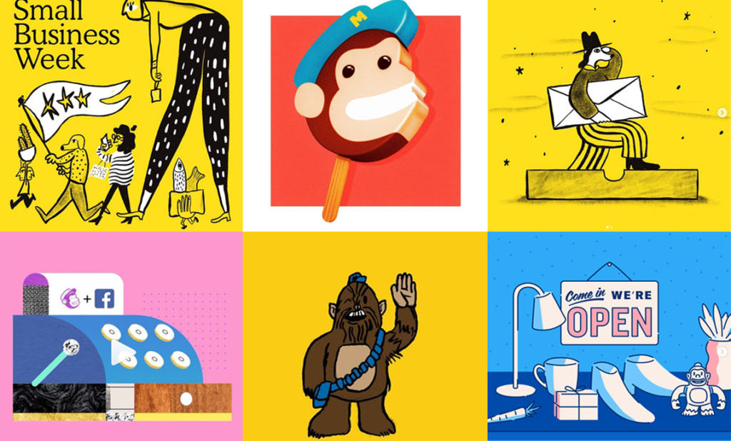
The key is to deliver consistent illustrations that are visually striking. Whether you decide to go abstract or not, the ads should be easy to identify and interpret. Mailchimp is a big brand that has dedicated their efforts to creating a unique illustration style as a way of branding themselves, you can see how much visual impact their ad illustrations make:

Bold but simple fonts
Fonts are like spices, it’s important to choose the right font to create the proper flavor. If you’re looking to add more flavor to your ads, looking at your brand fonts will be an easy way to create that impact.
In this digital age, fonts must be easy to read and digest. This doesn’t mean you have to go with basic and boring fonts. In recent years, companies have dared to experiment with brand styles. Some of the best social ads use bold, textured, and stylized fonts to communicate their message or call to action.
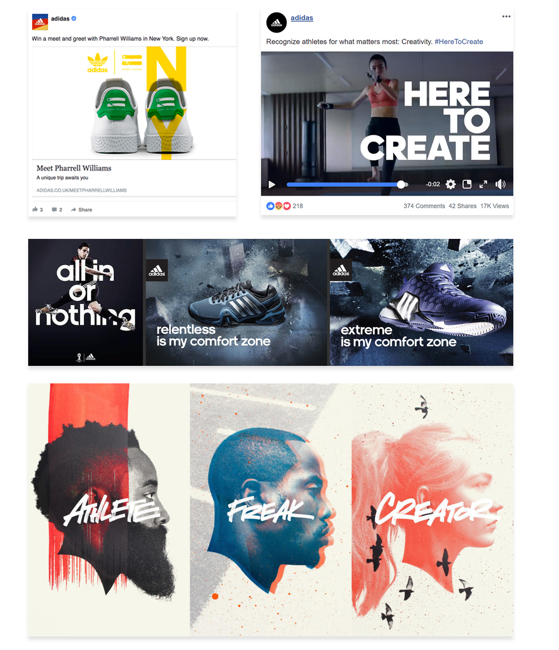
Fonts have become a crucial tool for designers when designing digital ads. Social media channels like Facebook have a text to image ratio rule that prevent companies from using a lot of text in their ads. This has limited a designer’s ability to go all in with sizes of fonts. Designers are pushing font styles to make use of the limited space available with these ads. Below are a few campaigns launched by Adidas that feature various font styles, you can see how they use bold text to bring attention to their ad’s message. Another thing Adidas does well is balance the use of clean typography with more abstract, handwritten, and rebellious font style. This is a good way to keep your ads fresh and allows you to stretch your brand’s image. All the ads use the text to create very interesting compositions that catch your eye.

video/animation/gif
Here’s the truth: the ads that are generating the most engagement are short videos or animated illustration gifs/videos.
Everyone wins, through videos, you’re able to provide more information or more reasons to convince users on social media. It is a much more fun and interactive ad experience that consumers enjoy engaging with.
Marketers are always asking themselves: “what can we do that our competitors are not doing?”
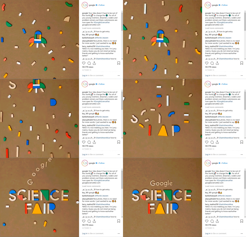
Video social ads is an ad concept that not many companies have got it together on yet. There are so many different directions you can take video work to communicate different messages, call to actions, and to develop brand identity. The possibilities are endless and it’s a form of ads that will continue to grow in popularity. Below is a gif that Google published, these are the kind of concepts that are taking over the online world. People cannot contain themselves, it is much more inviting to watch something animated or moving than an image or design. Not only does it grab more attention, but it provides you a much more flexible canvas to deliver your advertisement, sales, call to actions, information, or whatever it is you’re looking to accomplish with your ads. Gifs, video, stop motion animation, and other movement based ads are the most successful type of social ads. In fact, video ads generate 12 times the engagement and shares than text and image ads combined (Wordstream). Don’t fall behind, start investing into quality video productions to gain more social ad engagement.

Carousel story
On Facebook and Instagram, you are given the ability to create a carousel ad set that works like a slideshow. The carousel ad format can showcase up to 10 images/videos on both platforms. Companies are taking full advantage of this versatile way of advertising on social media.
Having 10 slots to work with is a massive creative opportunity. Marketers are taking carousel sets to create ads that flow as stories and work hand-in-hand to create a sequence of powerful advertisement. These are fun for users to click through, if you do it right you can take your viewers through a convincing journey that leads to your call to action.
Get creative with it, think about how you can connect the slides with each other to create unique experiences. Don’t be afraid to mix images and videos to develop your message. The goal is to create ads that speak to your audience, entice them to interact, and motivates them to follow through on your call to action.
Here’s a quick idea on how you can create a storyboard carousel ad set:
Slide 1: Introduce the topic
Slide 2: Present a problem
Slide 3: Use your business/product/service to provide a solution to that problem
Slide 4: Present a desire
Slide 5: Think about the benefits of your product/service and showcase how it meets those wants and needs
Slide 6: Lead up to your call to action with sale details, instructions, information
Slide 7: Deliver your call to action
Slide 8: End with your logo or a creative way to brand the ending, this is important as it establishes who you are and what you offer.
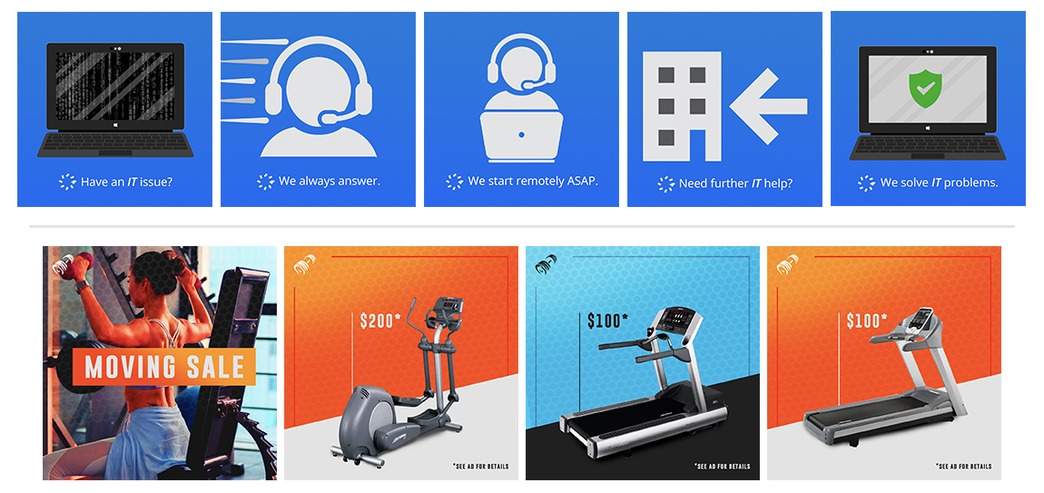
Below is an example of carousel ad set we created for two separate clients. In the top example, we used the icons to illustrate the caption under. The captions themselves create a problem and walk you though their solution. We made sure to include the same laptop in the first and last scene to illustrate the solution and tie the carousel. In the second example, we were tasked in creating a carousel ad that popped a lot on feeds. The idea was to make really emphasize their moving sale, we used their branding colors of orange and blue to create highly contrasting gradients that give more attention to the machines and special prices. The color scheme is also sequenced to create a consistent brand experience and to help differentiate the machines.

The Takeaway
If social ads haven’t worked in the past for you, look back at how you crafted your message, the visual, and the delivery. The best social ads are highly targeted to a specific audience in mind. To get the most out of social ads, figure out your audience and design ads that appeal directly to them. It’s easy to take any graphic and put social media dollars behind it. The difficult part is taking the time to develop a branded ad experience that resonates over time and speaks directly to the people interested in what you offer.
