How do you choose a font?
Looking to start your business and need a logo and font? Are you re-branding? Or are you working on a poster or book? Whatever it might be, this guide will help you on how to choose the right font or typeface.
The first question I’m going to answer for you is the one you had at the end of the previous sentence. What’s the difference between a font and typeface?
Font
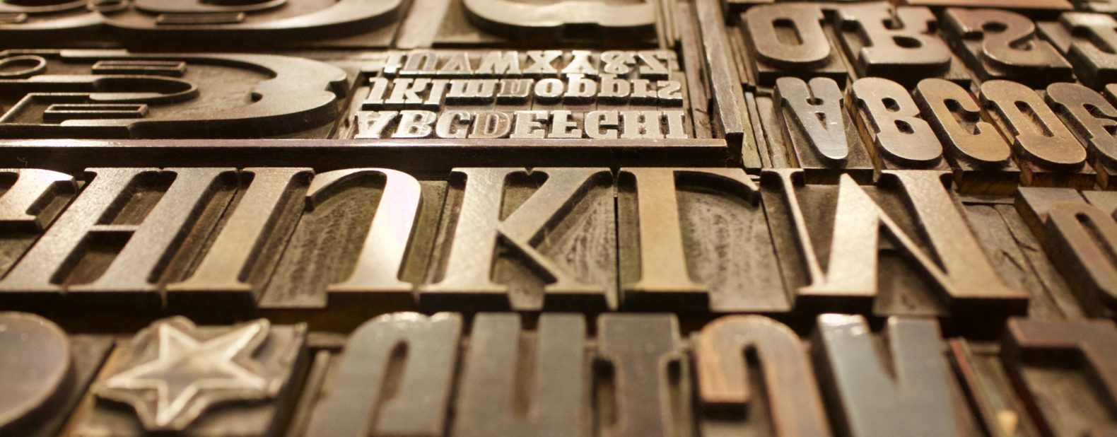
Simply put, it’s what you use. The usage of font originates from printers that used metal letters, numbers, and symbols. These were kept in a box and pulled when needed. Now the box filled with those metal blocks is called typeface.
Typeface
Is what you see, it describes a set of fonts. Printers had various boxes filled with different sizes of the same font with different weights. These all make up the typeface.
In today’s digital age, font and typeface are used interchangeably. But it should be known that the former makes up the latter. A digital file contains various letterforms, fonts, instead of a big box. So you can choose what typeface you want and it could include various fonts within the file. No shifting or moving around big, heavy, metal boxes.
Font equals Opens Sans Light and its typeface (AKA font family) is Open Sans.
Now onto how to choose a font!
Choose a category of type
Start with the typeface. This is what you think will match your work. ie. Monospace, Modern, Slab Serif, Sans Serif, Script. There are a number of fonts within these typefaces. For example, Sans Serif has Maven Pro, Proxima Nova, Futura, and Neue Helvetica.
Corbert (Light)

Proxima Nova

Futura (Light)

Neue Helvetica (Thin)

Quality of printer and paper
If you are printing from a low-resolution printer, any subtle font characteristics such as delicate serifs or fine lines will not get printed. So printing from fax machines and photocopiers is out of the question if you want all the details to show. The type of paper matters as well. If it’s going to be printed in a newspaper, it will absorb ink and lose the details of the font.
What is its purpose? How much text will there be?
Are you designing for a poster, a book, a report? A website or logo? When it comes to what you’re working on what’s more important to you? Readability or aesthetics? What is the purpose of the text? Are you going for a serious look, a casual look, a decorative look? Once you start narrowing down where and for what you will use the font on, it’ll narrow down the typeface and fonts that you can use.
How much space are you working with? Does it all need to be filled?
Different typefaces take up different amounts of space, even at the same point size. Bold, light, medium and heavy styles will change the amount of space available. Two typefaces might look the same at the same point size side by side, but once put in the workspace they’ll take up a different amount of space. You might have to sacrifice a font you like so that all the text you’re working with fits within the allotted space.
To settle on a font you must:
- Know what it will be printed on and how it will be printed. It’ll narrow down your font choices.
- Decide on the look you want to convey. Fun? Professional? Laid back?
- If you use more than one font, make sure the fonts are very different from each other. If the two fonts you use look very familiar, it will come across as a mistake. eg. Use a sans serif font for the headline and a Modern font.
Take a look at our previous work for some inspiration.
Still can’t decide on a font? Need help with your branding? We’re here to help!
More Perspectives:
5 SEO Tricks to Increase CTR (Click-Through Rate)
How Businesses Use Call Tracking to Drive Revenue
A New Facebook Ad Feature That Can Potentially Harm Your Business
FAQs
What’s the difference between a font and a typeface?
A font refers to the specific style or weight (like bold or italic) within a typeface. A typeface is the overall design or family of fonts, such as Open Sans, which can include various fonts like Open Sans Light or Open Sans Bold. While they are often used interchangeably today, typeface refers to the broader family, and font is a specific variant within that family.
How do I choose the right font for my project?
Start by considering the purpose and medium of your project. If you need readability for long text, like in a report or book, choose a simple, clear typeface like Sans Serif. If your goal is to make a visual statement, like in a logo or poster, you may opt for a more decorative or bold font. Consider the tone of the project (professional, playful, etc.) and choose a font that aligns with that message.
Does print quality affect font selection?
Yes, print quality plays a major role in font selection. Low-resolution printers or rough paper can distort fine details, so avoid using delicate fonts with thin lines or intricate details in these cases. Always test your chosen fonts to ensure they will print clearly and as expected on the paper and printer you plan to use.
Can I mix fonts in my design, and if so, how should I do it?
You can mix fonts, but make sure they are noticeably different to avoid confusion. A good rule of thumb is to use one font for headlines and another for body text. For example, pair a bold, decorative font for a headline with a simple, readable font for the body copy. Avoid fonts that look too similar, as this can appear as a mistake rather than a design choice.
