Hero Images
The word “hero” in conjunction with the word image has been making rounds on the Internet for some time. But if you haven’t heard or know what hero image means, no worries, we’re here to save the day.
A hero image is a large picture that is used as a background on a website. Think of it as a large header. The point of using hero images? To give websites an aesthetically pleasing and attractive look right from the beginning. Most hero images are photographs which relate directly to the website’s content. Other types of backgrounds used for hero images are illustrated artwork or animations. Hero images usually include either a heading or CTA. The great thing about using hero images is that your brand and content comes across in one section. It automatically sets the tone for the visitor without making them go through the entire website to find out who or what it is you do.
Showing visitors who you are or a behind the scenes photograph as your hero image peaks the curiosity of who you are and what you do.
Remember, a photograph is worth a thousand words.
Hero images are used with different types of designs. Large headers, single-page design, fullscreen background, featured post content, and rotating galleries.
Large Headers
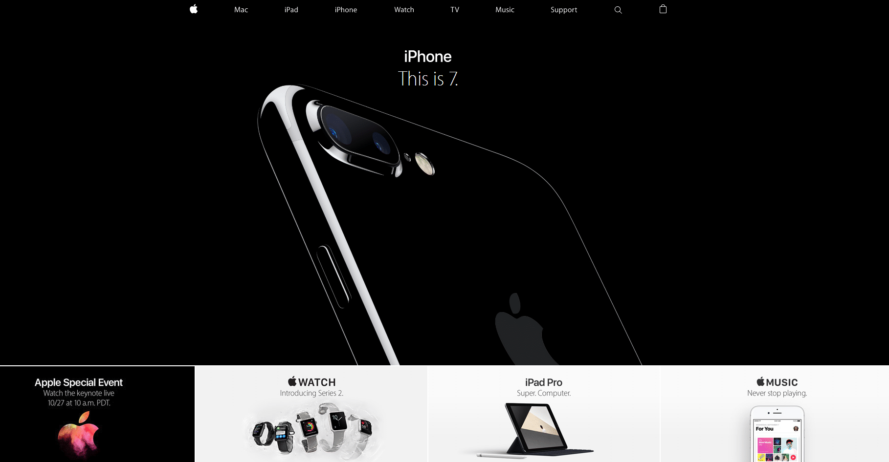
Hero images as mentioned before, are large images. They are used for part of the web page and usually, it’s the top portion of the page. Lucca’s has a hero image of its office space with its team doing work. On the other hand, Apple has a hero image of its hero product, (will be discussed in a later perspective), it’s iPhone 7. It quickly states what the site, or Apple, wants you to focus on.
LuccaAM
Large Header
Apple
Large Header
Single-page design
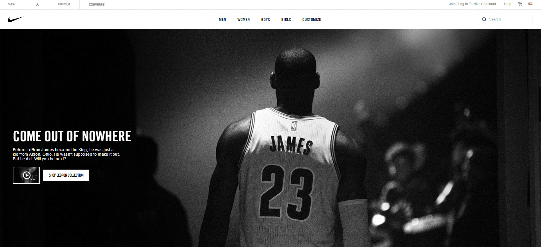
A single-page design is usually used for landing pages and for companies that do not have much information. People crave simple web pages so using a hero image with one will definitely please visitors. It adds value and aesthetics to a page with little wording. Who’s the king in single-page design? Nike. Although Nike does have a lot of information to share, it would rather have you look through the site to find it. One way the website does it is by providing a CTA that leads visitors to videos or the product being featured.
Single-Page Design
Fullscreen Background
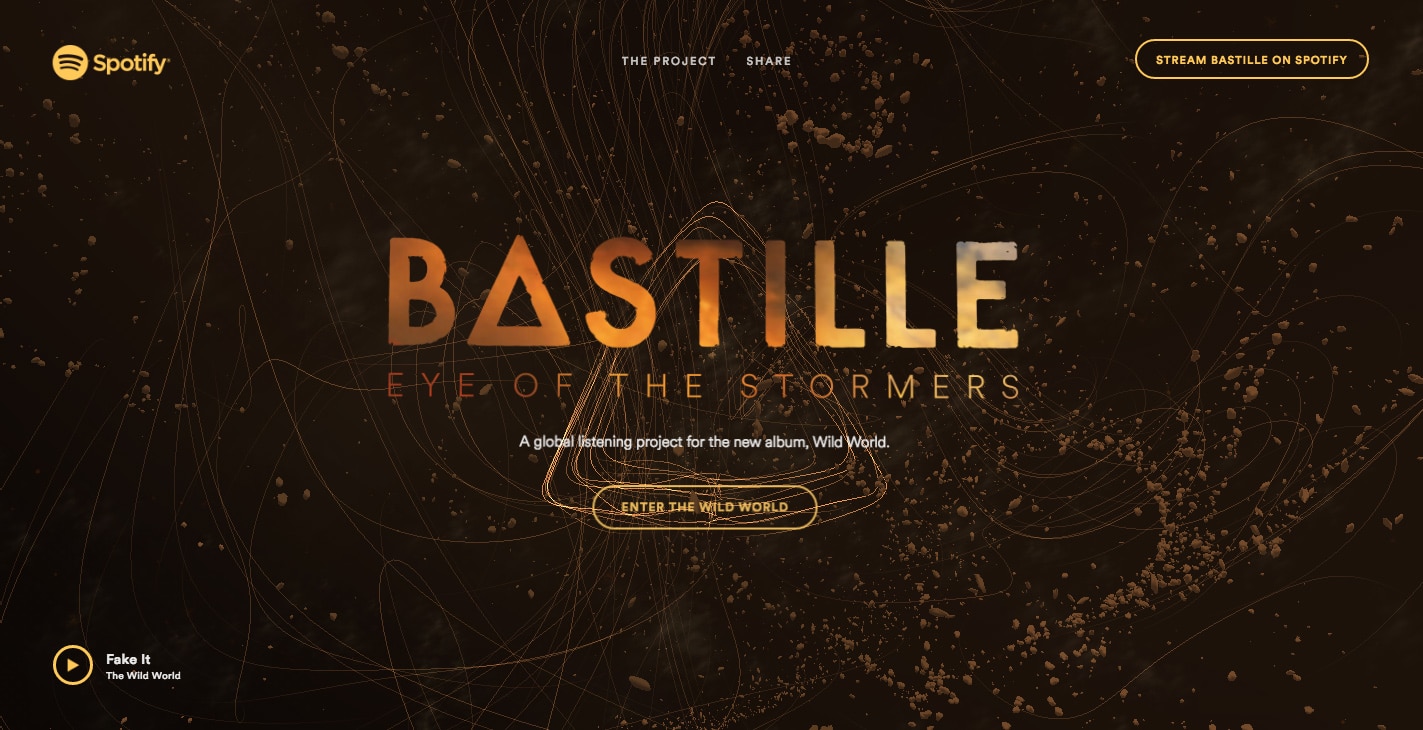
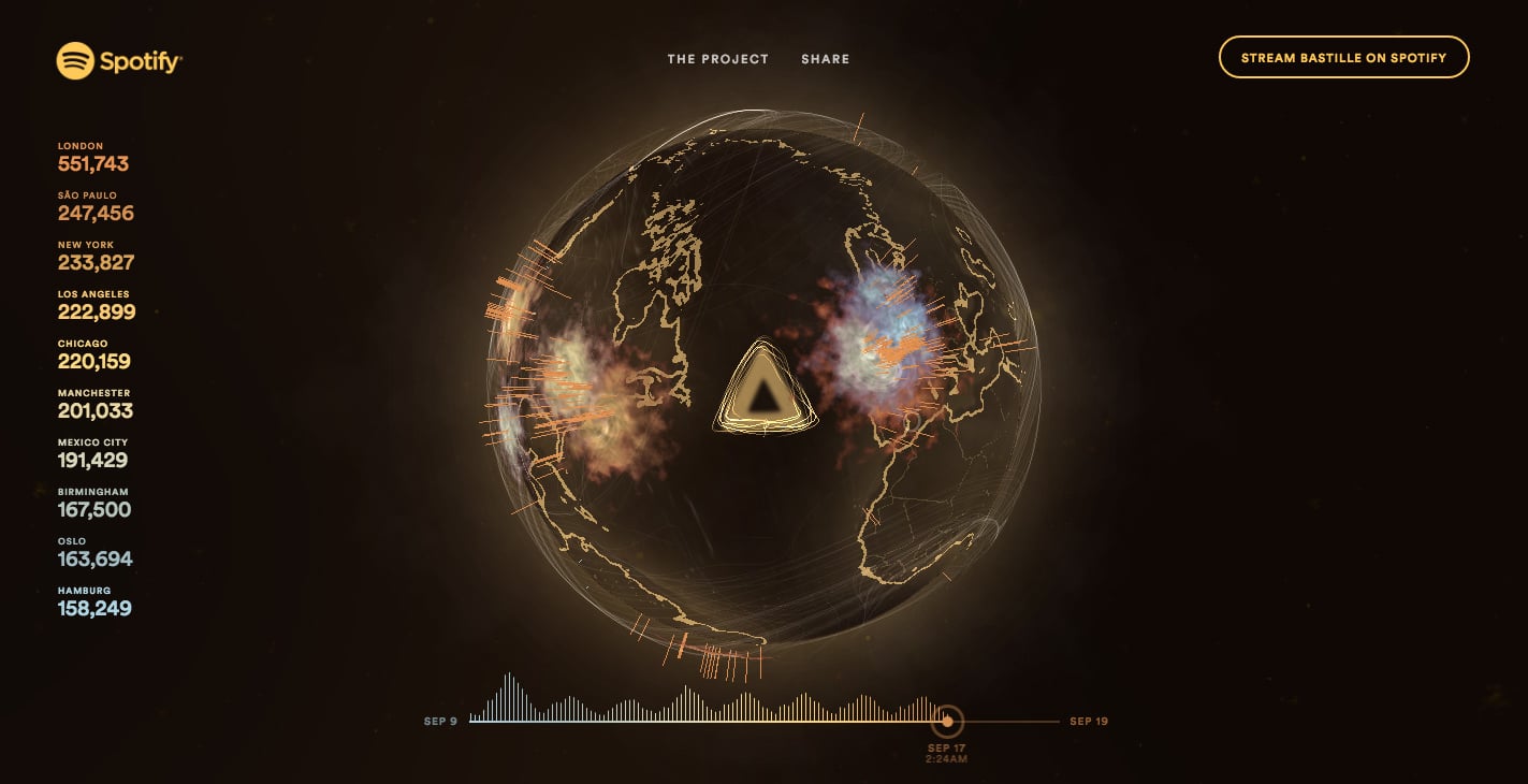
A fullscreen background and a hero image are not the same but they do go hand in hand in terms of concept and goals. A fullscreen background fills the entire page so there is no white space. Using a fullscreen background works well for showcasing products, even works, and there’s no need to add extra content on top of the image. For example, if a website sells furniture, a photo of a dining set as a fullscreen background is enough to get the point across. If the website is for a service like boxing classes, adding a photo of people during a class as the background works well. In this example, Spotify created a cool dynamic fullscreen background website for the band Bastille. Click through to check out how this background is anything but static.
Spotify
Fullscreen Background
Fullscreen Background
Featured Post Content
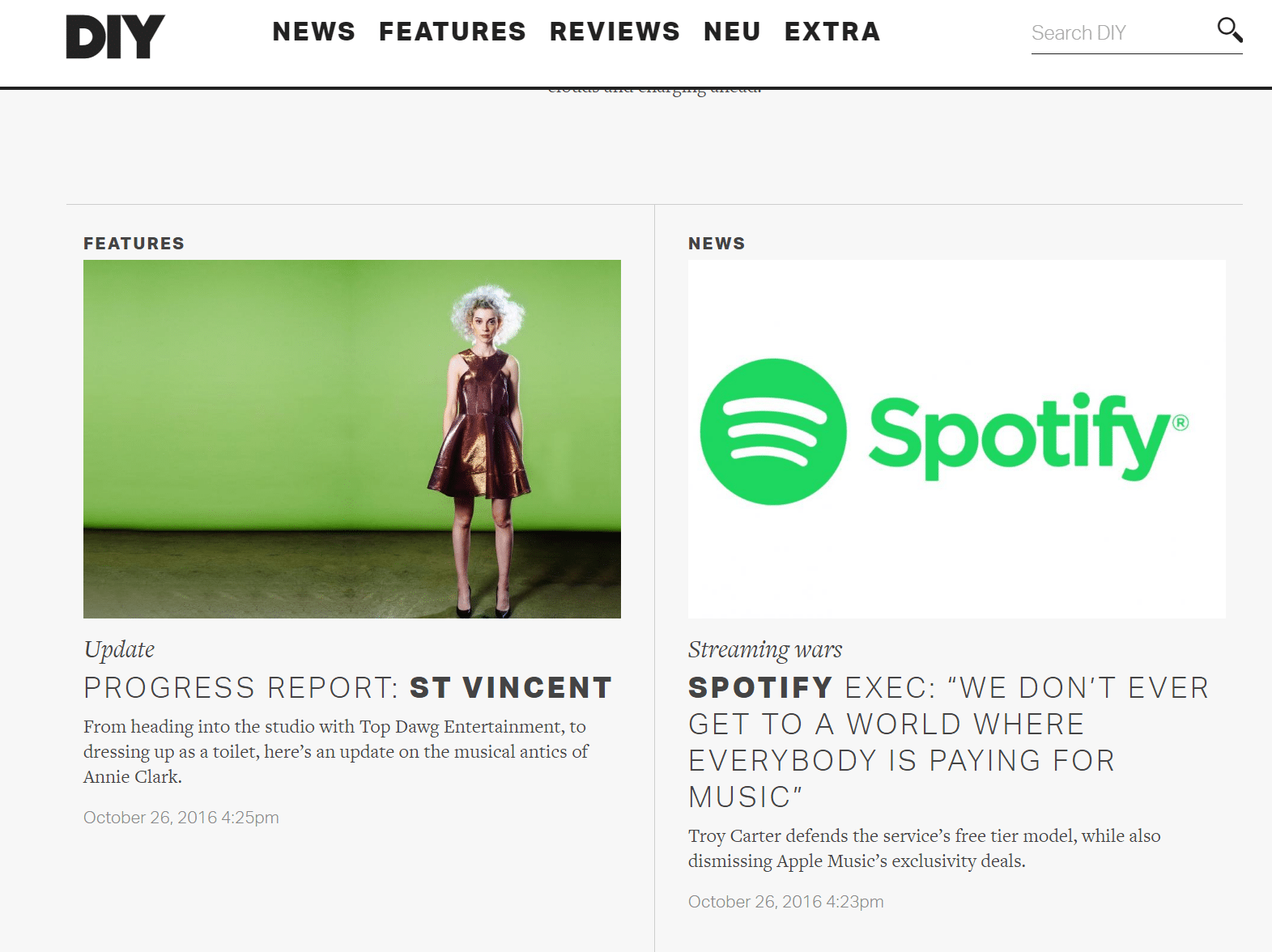
Articles or blog posts garner more attention with a hero image than without. This hero image is specific to the website content. It gives the visitor an idea of what the featured content is about. Although it won’t take up the whole screen on a websites page, it will entice the visitor to click on the image/post. It’s big enough to catch your attention but not completely distract from other portions of your website. By drawing attention to the one article or post, it opens up the possibility of drawing attention to other articles or posts that are offered. DIY has two featured post content hero images. On the left, they provide an update on the artist St. Vincent (still waiting on that new album!) and on the right features a news update on Spotify. Edit: St.Vincent finally announced a tour and a few new songs. No album yet.
DIY
Featured Post Content
Rotating Galleries
Matter of Form
Rotating galleries is where using hero images can get more creative and dynamic. With rotating galleries, you can include photos of a product, service, person, building, office space, locations, etc. Every hero image is used to explain a different facet of your website and brand. Click the link or the photo to see how Matter of Form does a great job with rotating galleries.
Rotating Galleries
As you can see there are different uses for hero images. Taking from the examples provided should give you plenty of ideas to work with. Remember that the photos or images you use have to be high quality. You want to put your best foot (hero) forward. Experiment on where and how to use hero images and see which ways work best for your website. We’re certain that these heroes are here to stay.
Do you want to add your logo to a hero image? Make sure it’s in vector and not raster format.
For more perspective post about design, SEO, or marketing head here.
Don’t forget to subscribe to our newsletter at the bottom left!
FAQs
What is a hero image on a website?
A hero image is a large, visually striking image used as the background or header on a website. Its purpose is to grab attention, set the tone for the site, and provide visitors with an immediate sense of what the website or brand represents. It often includes a heading or call-to-action (CTA) to encourage further engagement.
How can hero images improve my website?
Hero images create an aesthetically pleasing design that instantly engages visitors. By showcasing a relevant image, they convey your brand’s message in one glance, encourage user interaction, and help guide visitors through your website, especially when paired with a strong CTA.
What types of hero images can be used on a website?
Hero images can be photographs, illustrations, animations, or dynamic elements. They are commonly used in large headers, single-page designs, fullscreen backgrounds, featured content sections, and rotating galleries, each enhancing user experience and branding.
What are the best practices for using hero images?
Ensure that your hero images are high quality and relevant to your website’s content. Use them to reflect your brand or showcase products. They should not overwhelm the user but complement your website’s design. Including a clear call-to-action on top of your hero image can help guide users toward their next step on your site.
