2023 DESIGN TRENDS
2023 is here. New year, new decade, new era!
WHAT WILL GO, STAY, START, & COME BACK?
The start of the year means the start of new possibilities. With the year 2023, we are also looking at the start of an entire new age of design. The opportunity to define and influence visual experiences is there and designers are looking to provide the evolution of design.
It will be interesting to see what trends make a comeback and what styles disrupt the entire industry. We expect the early 20’s will experiment with the ideas of futurism, functionality, minimalism, and unique details.
Instead of listing design trends, we want to predict design trends like this:
- What will go
- What will stay
- What will come
- What will come back
WHAT WILL FADE
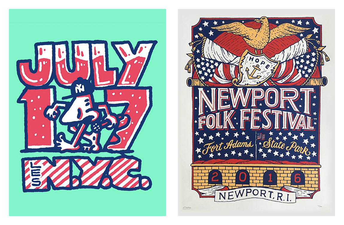
In the last decade, design styles were high in detail and complex in composition. There was a major influence by designs that had a lot of attention to detail. The most popular designs were inspired by old vintage advertisement, crafted signage, and illustrations. The main draw was the great attention to detail that vintage designs had. Below are examples that created a modern retro look inspired by vintage design work:
Designers took those vintage inspirations and began to modernize the ornate details, intricate typography, and muted subdued color schemes. As we enter the 2023, design styles are shifting to a more vibrant, futuristic, and minimal look. Big brands are simplifying their designs to focus on contrasting functional designs. Despite the growing popularity in minimal design, we don’t expect these modern interpretations of vintage artwork to fade fast. There is still a large admiration for detailed craftsmanship and the nostalgic value is too high to forget quickly. New York based artist, Jon Contino, has managed to take vintage inspirations and created a new way to incorporate hand made details, illustrations, and typography.
WHAT WILL STAY
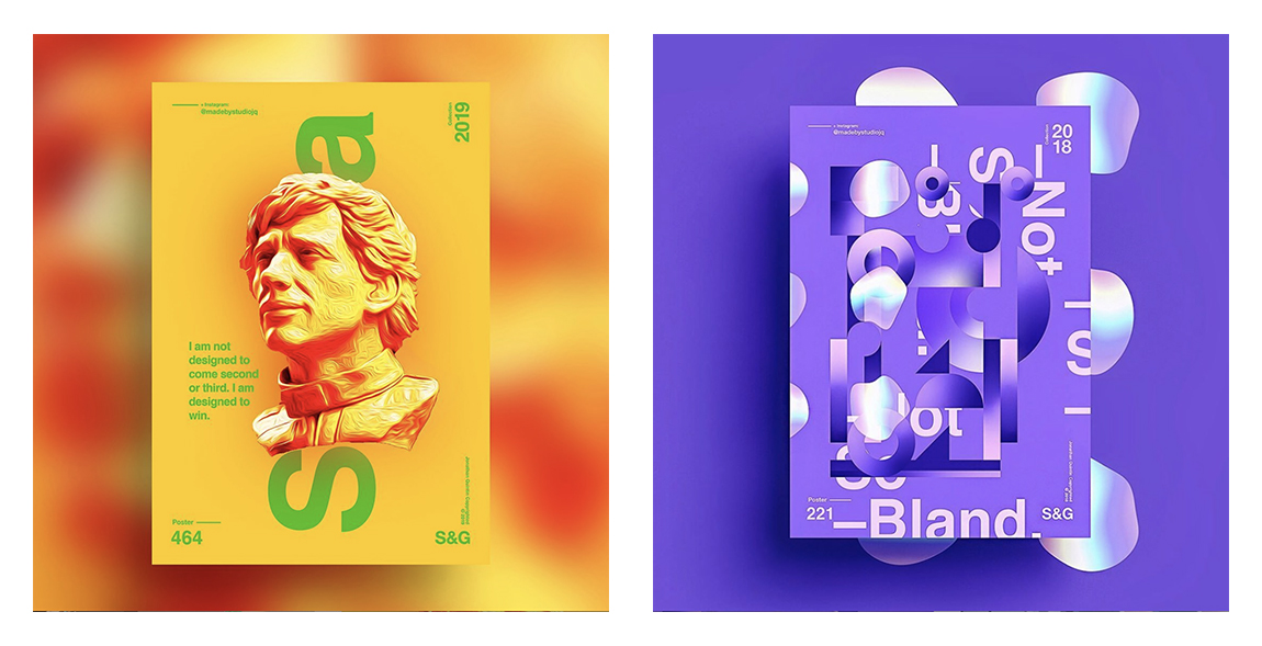
In 2019, we started to see more vibrant color schemes. We think this will be a design trend that will stay but evolved to use more futurist colors. Expect to see unique gradients that contain hues of cyan, magenta, and other colors that hint a futuristic sci-fi world. Companies are looking to show they are thinking in the future with colors that provide a luminous feeling of modernism.
Get ahead and start to incorporate vibrant futurist gradients to elevate the brand’s visual identity. Colors like hot pink, neon green, cyber blue, and infrared orange will help brands stand out in a world busy with great design. These over saturated hues will be something new to people as these colors are not common and natural in our daily lives. One artist we’re fond of is @Madebystudiojq, this designer uses very vibrant gradients and color swatches to create very loud designs. The flyers below show how colors can be used to communicate a very modern and futuristic style. Expect to see layouts like these where copy and placement treatments will be more abstract and less symmetrical.
WHAT WILL COME
As the world continues to modernize, we are starting to think and imagine what the next evolution will look. Think about Tesla’s newest Cybertruck, the design of the truck has re-imagined the way a vehicle should be shaped. If you break down the design, it is a very simple and geometric based design with hard lines. The design has created a lot of conversation, with opinions mainly focusing on how different and abnormal the truck looks. It’s easy to see the minimalist approach to the truck, this is the trend we see going forward in the approach of future design styles.
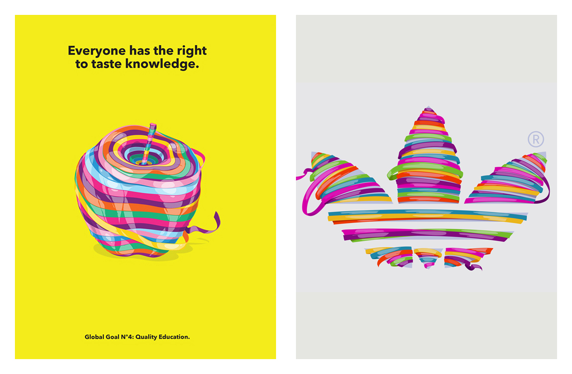
It’s clear that brands are enjoying minimalist layouts with intentional bold simple details. As this concept keeps growing, we’ll start to see clean, balanced, and spacious designs. Simple layouts doesn’t mean boring and stale designs, on the contrary. Designs are starting to be more selective and abstract on how to approach focal points. You’ll start to see fonts with big personalities, thin and stable line shapes, and spacious layouts with interesting placements. Adhemas Batista is a designer who uses colorful and vibrant line work to create shapes. Check out two posters Adhemas designed, the design is arranged in a very minimal and spacious layout format. All the attention goes to the vibrant elements and allows the user to quickly take in what they’re seeing.
WHAT WILL COME BACK
Creating the next trend is a thrill, but it’s also fun to bring back old trends to recreate a nostalgic experience. There are plenty of design resources available to help companies create visuals, having good looking content is not difficult anymore. The new challenge is making yourself standout. To really differentiate, companies are starting to carefully plan the way their brands are presented. This means no detail is too small when thinking about designs. We’re starting to see brands invest more into highly custom and tailored graphics that are true and unique to them.
These details can be seen in font treatments, a combination of clean fonts and handmade fonts will begin to surface more. Simple, curved, and easy on the eye font types are often used to express a modern and futuristic style. To communicate craftsmanship and grab more attention, font types that are brushed and hand made will become more popular as opposed to ornate vintage font types. Brands are also looking for different ways to add to their brand image, patterns are a powerful way to create authentic looks that can be applied throughout the brand’s presentation strategy.
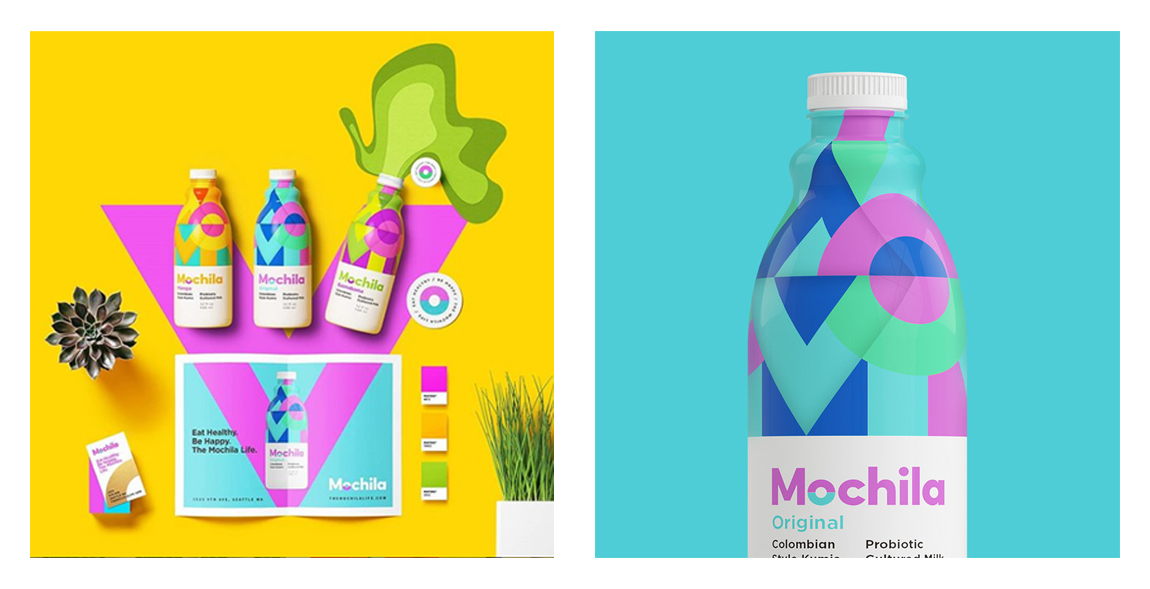
Mochila Packaging
