Every day millions of us hop on the internet and peruse through websites. Whether we’re looking for recipes, shopping for home necessities, getting updated on the latest news or working. It’s become our norm; a part of our daily routine. But how many of us have thought about how a website is made? In this perspective, I’m going to take you behind the scenes of how we design a website.
Briefing
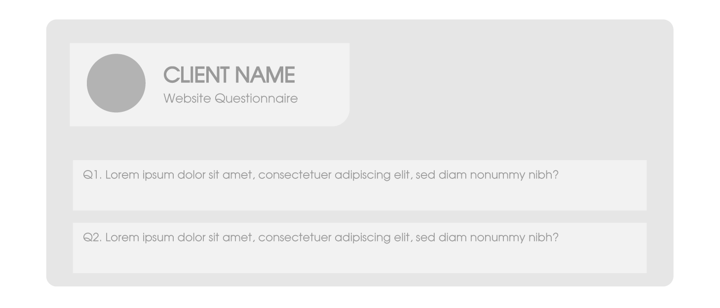
Before we begin our project, a meeting is set with our client to get a feel of what they’re looking for, what message they want to convey through their website, how they differ from their competition and what goals they want to achieve. We provide a questionnaire to better understand how they need their website to perform. To get an idea of how large the website is, we request a sitemap. During the briefing stage we also discuss the features their website needs, the features they would like to have, and if it is within their budget.
Collecting Files
No one knows a company better than the people that work there and the people who own it. During this phase, we ask our client to provide each page’s content (text and images) to get an idea of exactly how we need to design a page. As Bill Gates says, “Content is King”. Based on the sitemap and the files we receive from our client, we can determine which pages need special layouts.
Research and Brainstorming
As we research, one of the first things we do is look at our client’s competition. We examine their strengths and weaknesses and use it to our client’s benefit. We study the ever-changing trend of design to make sure that when we get to the design phase, we are creating a site that is current but lasting. The website should especially cater to the feel, and truly present the company’s identity. We also take into consideration what their target audience would be looking for, because in all honesty, although a website represents a company, how it functions should be determined by who the audience is. Once we have an idea of which direction we need to go, we sketch out possible site layouts.
Designing a Website
Designing
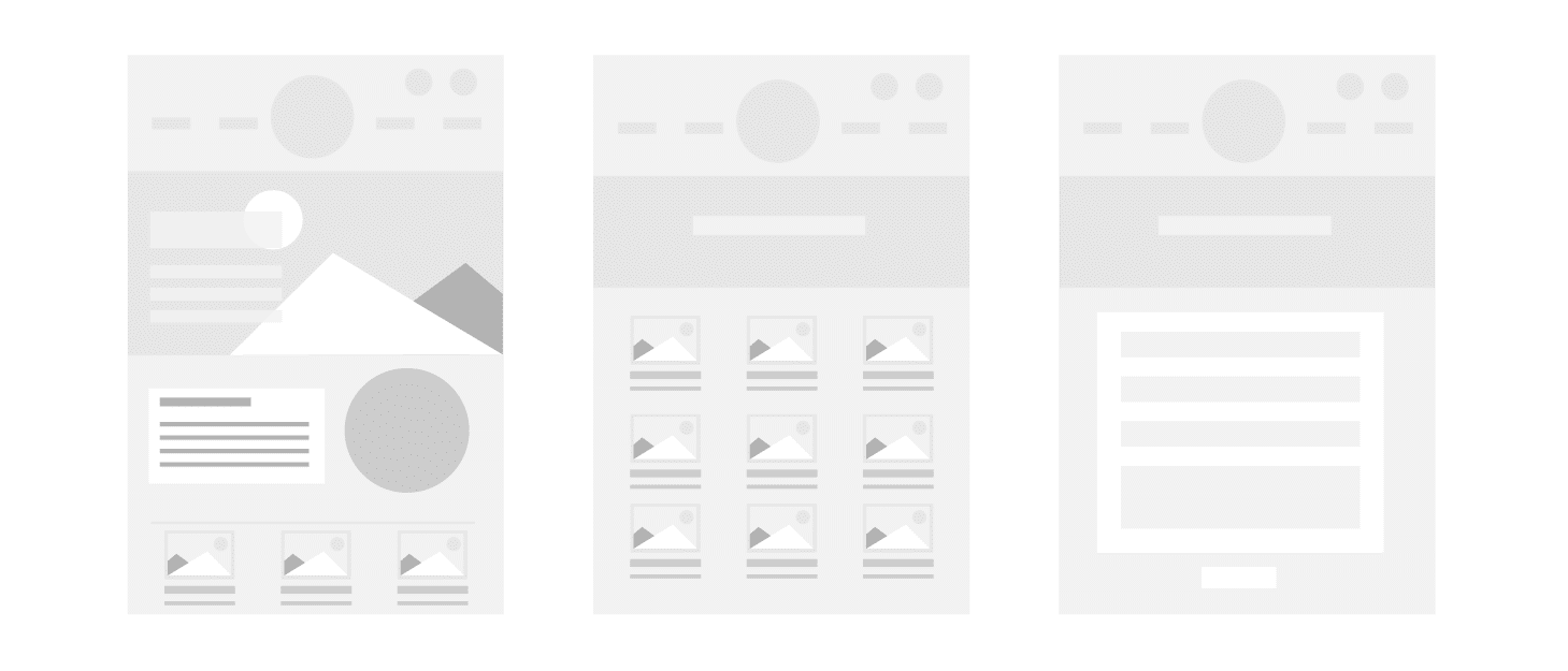
We begin creating the website’s homepage wireframe. If our client has provided us with a brand identity manual we make sure we are using their color palettes, fonts and make sure the website is cohesive with any of their current designed pieces. The homepage is the first page created as it sets the tone for the entire website.
If our client does not have a brand identity manual, we go off what we have (usually the logo) and based on our research, we create a color palette that helps deliver their message. We look for fonts that also match the personality of the brand. If the brand is more laid back, approachable, we look for fonts that reflect that personality.
When the homepage is complete, we send a sample to our client for feedback. Once the homepage concept is approved, we design the secondary page concepts and present them to our client using a program that allows them to navigate through the concepts as if it were an actual website. Halfway through designing a website!

Development, Content Loading, and Refinement
We work with our development team to build the website. Once the site is built, we load all the content and the refinement stage begins. We send a test link to our client for feedback to see if they need us to make adjustments. We thoroughly go through the website and perform in-depth quality testing. Once the site is ready, we prepare to launch.
A website is never done. As I always say to our client, when it comes to websites, nothing’s set in stone. There’s always room for change. In this fast-changing environment, there are brand new features that increase visitor engagement and we collaborate with our clients to ensure their website is up to date. It’s pretty fascinating to know all the effort that’s put into designing a website!
