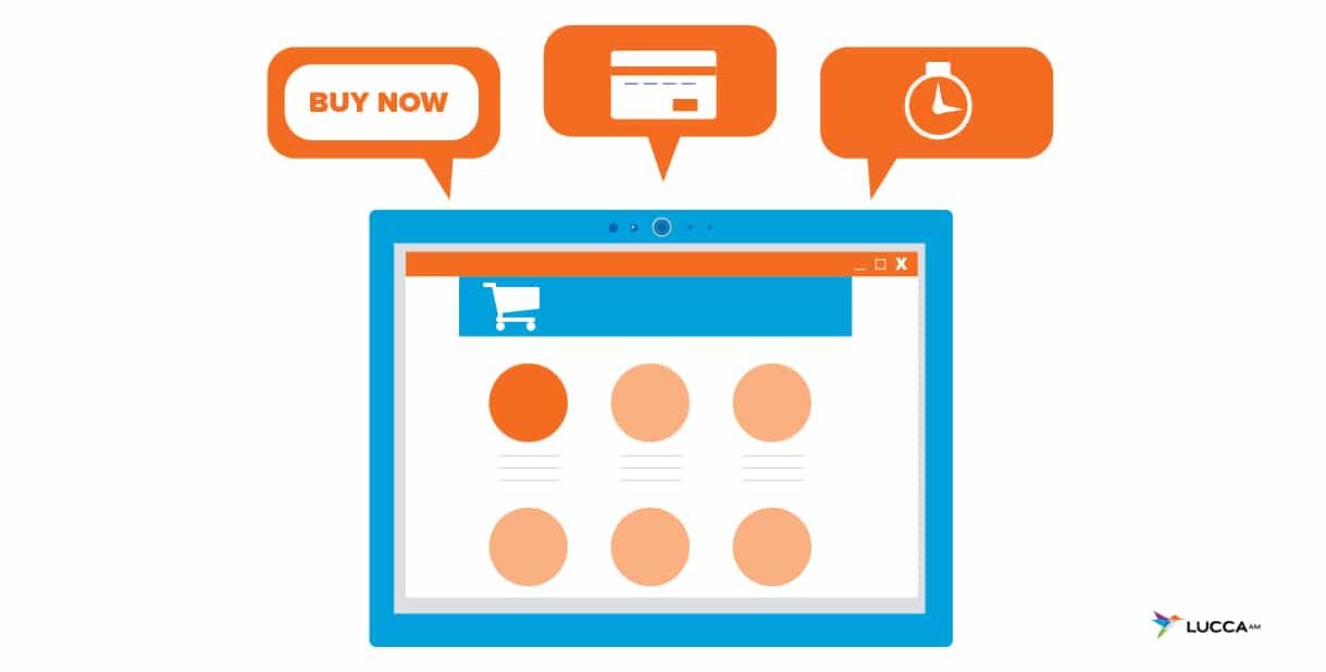
6 eCommerce Mistakes and How to Fix Them
There are many different types of eCommerce mistakes that can occur even after the initial launch. The following mistakes and solutions are the most common.
1. Site Security
Everyone worries about their data when they are online, even more so when ordering online. Users want their data to be secured and that means that the website itself has to be secure. According to Flavio Martins, VP of Operations of DigiCert, “Studies show that up to 25 percent of users have actually stopped an online purchase because of website security concerns.” This is a bigger concern for smaller eCommerce sites since the number of sales are smaller so the loss impact is much bigger. A website is secure when you see this: ![]() at the top left of the address bar. HTTPS is a digital certificate that provides your website authenticity and an encrypted connection to protect online users’, in this case, online shoppers’ data. The great thing about switching your website from HTTP to HTTPS is that it can be done quickly and within budget. That green lock on your website speaks volumes.
at the top left of the address bar. HTTPS is a digital certificate that provides your website authenticity and an encrypted connection to protect online users’, in this case, online shoppers’ data. The great thing about switching your website from HTTP to HTTPS is that it can be done quickly and within budget. That green lock on your website speaks volumes.
2. Unintuitive or Tedious Website Navigation
If your customers can’t find what they’re looking for or things are shown clearly, prospective customers will leave the site! Navigation should be simple and easy. Menus should be precise to minimize the number of clicks, work, for customers to find what they’re looking for. And if on mobile, the mobile version of the site should be responsive. No one wants to waste time zooming in and out and scrolling a page. A responsive page also helps with loading speed.
3. Search Bar Capabilities
According to Andy Eades from Elevate Web, “customers who use on-site search to find products are more than three times more likely to convert than customers who don’t.” Relevant and quick results help speed up the buying process and make it easier for users to find what they’re looking for.
4. Bad Quality Product Images
Most of the time customers go online to see the product before heading to the brick-and-mortar. But if your business is online only, customers need to see exactly what the products look like and the different colors. It’s important to have multiple angles and have a zoom in feature.
5. Contacting the Seller is Difficult
![]()
In case anything happens with the order, customers want the option of contacting the seller. Whether the order did not go through or there are shipping questions, a phone number or email provides that accessibility. A clear communication avenue is especially important with eCommerce.
6. Too Long of a Checkout Process
Once customers have decided to go ahead and purchase an item, they want the process to be simple and quick. When your checkout process has too many unnecessary question or fields customers are will abandon the website and it leads to lower conversion rates. If the checkout requires multiple checkout pages it drives people away. The time that online users put towards researching a product is extensive, once they decide on the product they want the most hassle-free checkout process. Plus, the quicker the process the less time there is for the user to have to re-evaluate their decision.
Have any questions regarding any of these common eCommerce mistakes? Contact us today! We can help secure your website, make it responsive, and much more for your eCommerce!
Keep updated on all things Lucca AM by liking us on Facebook and follow our Instagram feed for behind-the-scenes of our office.
We have more Perspectives to share with you:
How Good Design Can Help Tell Your Organization’s Story
How to Use Social Media as a Nonprofit
FAQs
How can I make my eCommerce site secure for customers?
To secure your eCommerce site, switch from HTTP to HTTPS by acquiring a digital certificate, which ensures your site has an encrypted connection. This green lock icon on your website reassures users that their data is protected, increasing their trust and likelihood of completing a purchase.
Why is intuitive navigation important for eCommerce websites?
Intuitive navigation helps customers find what they’re looking for quickly and easily, reducing frustration and preventing them from leaving the site. An effective menu minimizes clicks, and a responsive mobile version ensures that users can navigate the site seamlessly on any device, improving overall user experience and conversion rates.
What impact does the checkout process have on eCommerce sales?
A lengthy or complicated checkout process can lead to high cart abandonment rates. Customers prefer a quick and simple checkout with minimal fields to fill out. By streamlining the process, such as offering a one-page checkout or guest checkout option, you can increase conversion rates and minimize drop-offs.
Why are high-quality product images essential for an online store?
High-quality images allow customers to get a detailed view of products, building trust and helping them make informed purchasing decisions. Multiple angles, zoom features, and images showing different product variations (e.g., colors) are especially important for online-only businesses that do not have a physical location for customers to visit.
- 5 Tactics for Increasing Black Friday and Cyber Monday Sales in 2024 - March 5, 2024
- 5 Most Important Google Ads Metrics - July 11, 2023
- What is Headless Commerce? - May 23, 2023
